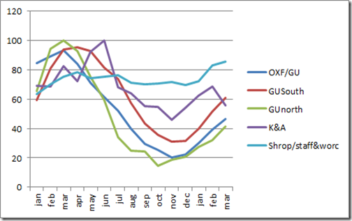
They say a picture is worth a thousand words, so I used BWs reservoir watch figures to produce this chart,. I suppose it just tells us what we already know –that there ain’t enough water for the time of year. The graphs cover the period from January 2011 until March 2012. The vertical axis shows the percentage fill level of the reservoirs for the canal groups listed.
What it shows for the Grand Union in particular, is that over the course of last year the reservoirs used up between 70% and 80% of their water, and over this winter we have only put 25% back. Now that the boating season is under way, we should expect the graphs to turn downhill again albeit at a lesser rate because of the restrictions in place. Unless we get a lot of rain, it all points to closures by late summer.
A bit about the canal groups:
GU is a bit complicated as it is in three bits – the OXF/GU line covers the Oxford canal and the GU in the Braunston area. It’s interesting to see that the three GU lines follow pretty much the same course, although the GU north seems to have changed more significantly.
Kennet and Avon looks a bit erratic doesn’t it. I wonder why that is.
I included the Shroppie/ Staffs & Worcester area mainly to show the contrast once you get north of Brum. They’re actually better off now than a year ago. I haven’t shown northern canals such as the Leeds and Liverpool because the chart is getting a bit crowded, but suffice it to say their reservoirs are full!
Never Mind. Rick tells me it rained well in Buckby all day yesterday. That’s the spirit!
No comments:
Post a Comment